
Safety Sign Errors and Violations to Avoid
Correctly displayed safety signs are a necessary element for any workplace. They should be obvious and send a clear message informing everyone of potential hazards in the area. There are right and wrong ways to display messages, so knowing the proper methods will keep your employees safe and your business compliant with OSHA standards.
Post Signs Only When Necessary
Only post current warnings to raise awareness of potential hazards. Remove any signs of past notifications or safety recommendations not relevant to the current conditions, as it can lead to a worker overlooking the pertinent information. By doing this, the existing signage will reinforce appropriate hazard warnings and avoid potential unintended safety issues.
Select Proper Colors
The color of the signs for placement in the workplace is essential to ensure compliance with the law. Here are some fundamental rules to follow:
- Caution signs that denote less hazardous situations should always have a yellow background with a black upper panel that reads CAUTION. The sign should indicate the type of hazard or condition with a graphic that is easy to understand.
- Warning signs should indicate moderate risks that can lead to severe injuries or death associated with equipment, roadwork or sharp objects. The signs must have an orange background with the word WARNING on the top panel.
- Biological hazard signage requires red-orange or fluorescent orange coloring with contrasting text to display its message.
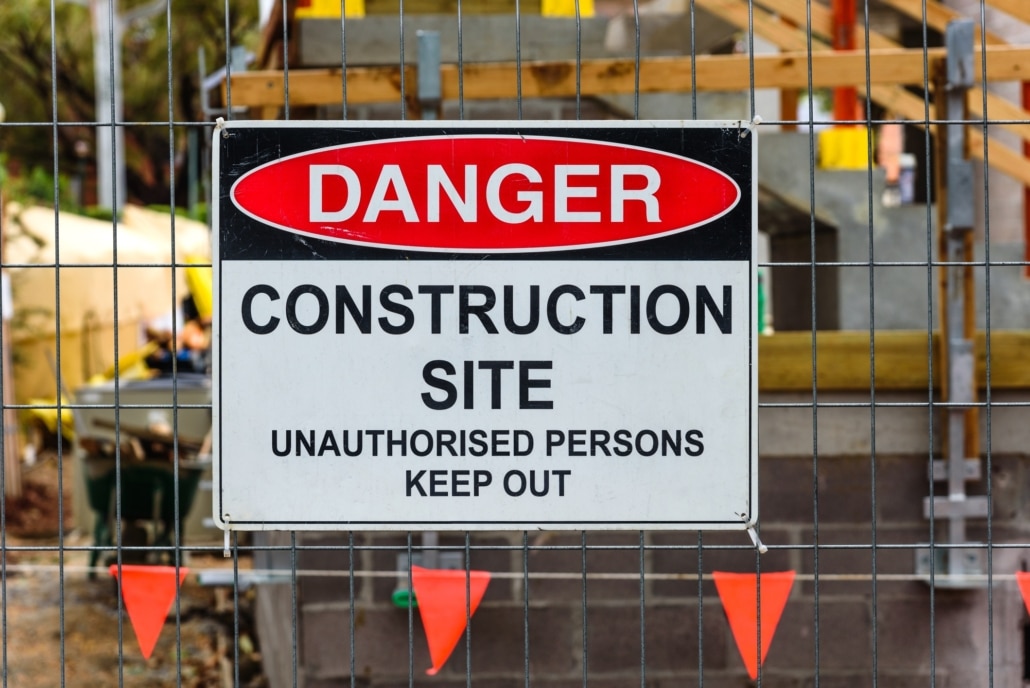
- Danger signs indicate difficult situations resulting in immediate bodily injury or death. The signs must combine red, white and black with the word DANGER at the top.
Using non-emergency colors for signs that address general information is recommended. For instance, policy and procedure signs are typically in blue or green.
Place Signs in the Correct Location
The visibility of safety signs ensures that all workers have reasonable access to their messages. The signs should be in reasonable proximity to allow the worker time to avoid the hazard. The signal word (Warning, Caution, Danger, etc.) should be at least five feet from the reader and in a prominent location. Other placement considerations are as follows:
- Ensure the sign is at eye level and, if necessary, include an arrow pointing to the elevation of the hazard.
- If posting the sign on a gate, place it on the side of the latch, a customary place for most people to look.
- Place the sign in a well-lit area. If it is not possible, include lighting to make it more visible.
- Keep the signage away from obstructions or obstacles that limit its visibility or its ability to indicate the hazard.
Choose the Proper Design
Before purchasing a safety sign, check the requirements to ensure the sign complies with the law. There is a general set of standards defined by OSHA.
Send the Right Message
Clear and concise messaging on warning and safety signs is crucial for employees to immediately recognize potential dangers and avoid accidents. At Construction Safety Experts, we prioritize worker safety and offer a range of safety training and risk management services to help businesses create a safe workplace. To learn more about our services, call us at (919) 463-0669 today.


